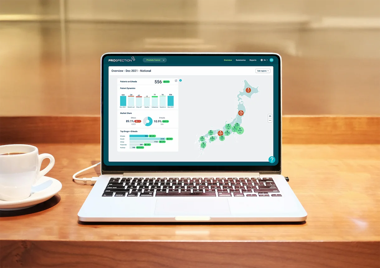
Prospection platform — Dashboard
Empowering marketing managers to access critical pharmaceutical performance data, without waiting for analyst support.
Empowering marketing managers to access critical pharmaceutical performance data, without waiting for analyst support.
Marketing managers at our major Japanese pharmaceutical client were constantly bottlenecked by data access. Every time they needed to understand market share, identify patients who should transition from older to newer treatments, or assess competitive positioning, they had to submit requests to data analysts and wait for custom reports.
This dependency created delays in critical business decisions and frustrated marketing teams who needed real-time insights to effectively manage their portfolios. More importantly, it hindered their ability to quickly identify patients on older treatments who could benefit from transitioning to newer medication with fewer side effects. This is a key factor in getting patients on the right treatment faster.
As the senior UX designer for this project, I transformed complex healthcare datasets into an intuitive self-service dashboard that gave marketing managers direct access to the insights they needed.
Through interviews with marketing managers and data analysts, I uncovered the core problems:
Marketing managers needed the same types of insights repeatedly (market share, patient populations, competitive analysis)
Data analysts were spending significant time on routine requests rather than complex analysis
Critical business decisions were delayed while waiting for data requests to be fulfilled
Patients were often on older medications, when newer medications with fewer side effects were available
I collaborated with both user groups to map out the most critical data relationships and create a logical hierarchy that matched marketing managers' mental models.
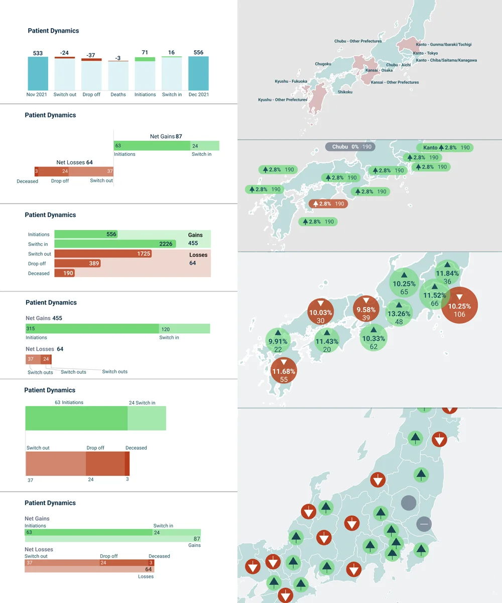
A key challenge was selecting the right chart types to make complex pharmaceutical data immediately comprehensible to non-technical users, including geographic performance patterns across Japan.
Through multiple rounds of prototyping and testing with actual marketing managers, I refined the interface to ensure they could find answers to their most common questions within seconds, not minutes.
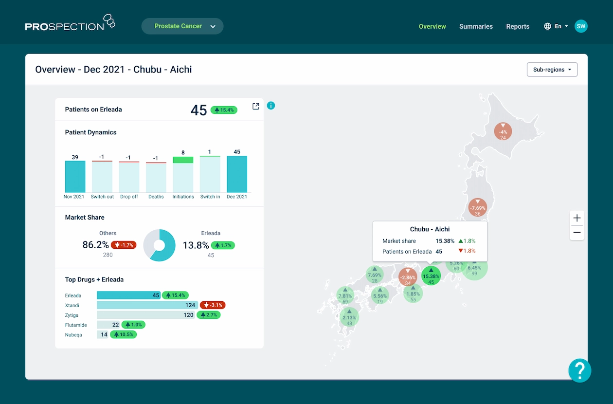
Marketing managers could now instantly access market share data, competitive positioning, and patient opportunity insights for their entire drug portfolio—tasks that previously required analyst support and waiting time. Most importantly, they could quickly identify geographic areas where patients remained on older treatments and direct sales representatives to engage with doctors in those regions about transitioning patients to newer, more beneficial therapies.
The interactive prefecture maps revealed regional treatment patterns that were previously hidden in spreadsheets—managers could now instantly spot areas with high concentrations of patients on older drugs and strategically deploy sales representatives to educate doctors about newer treatment options. This targeted approach enabled more efficient resource allocation and accelerated patient transitions to more effective therapies across Japan's diverse healthcare landscape.
The intuitive chart selections and clean visual hierarchy meant marketing managers could interpret complex data patterns without training—waterfall charts immediately clicked for understanding patient dynamics, while the consistent visual language reduced cognitive load when switching between different data views.
The self-service dashboard freed data analysts from routine reporting requests, allowing them to focus on complex strategic analysis that truly required their expertise.
This solution proved critical for maintaining operations with the major Japanese client, directly contributing to contract renewal and expanded partnership.
The intuitive interface required minimal training. Marketing managers began using it effectively immediately, confirming that the design successfully bridged the gap between complex healthcare data and business decision-making.
Transforming a flagship product to improve the clinical experience
View case study