Accessibility and Inclusivity Toolkit
Creating a comprehensive digital accessibility resource that achieved widespread adoption across NSW Government and industry recognition.
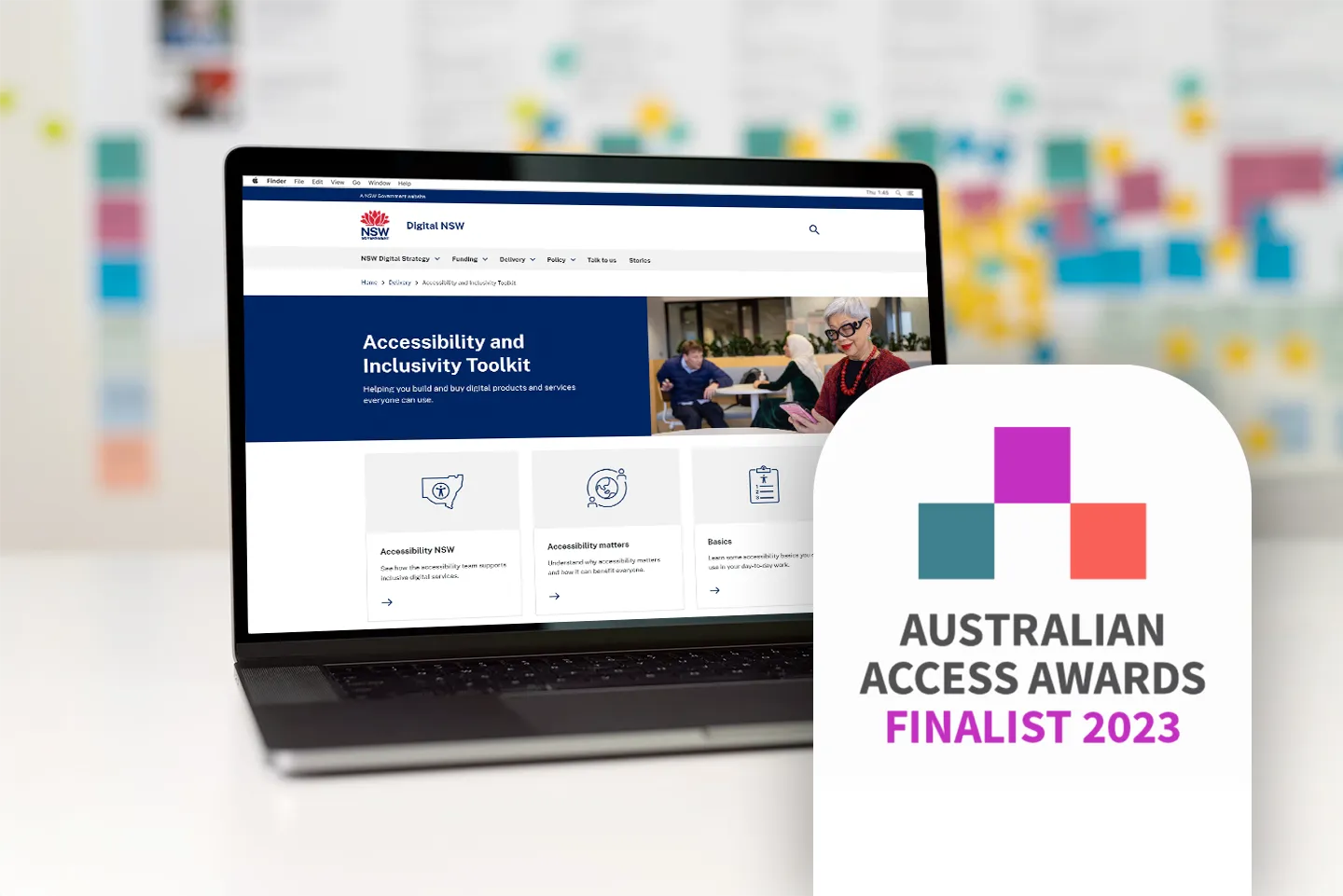
Creating a comprehensive digital accessibility resource that achieved widespread adoption across NSW Government and industry recognition.
The agency's flagship product, the Accessibility and Inclusivity website, was failing to serve its users effectively. While the site looked unfinished and contained outdated content, the underlying issues ran deeper than surface-level problems. Stakeholder feedback indicated the site wasn't meeting user needs, but specific pain points weren't initially documented.
The Director recognised the need for a complete overhaul based on comprehensive research and consultation to understand what wasn't working and why.
My role was to come up with a plan to determine what wasn't working and improve the website.
I followed a user-centered design approach, involving stakeholders and end users throughout the process to ensure the toolkit would meet real-world needs.
Through stakeholder interviews with the Director and team members, we established project goals and documented known issues from internal perspectives.
Conducted interviews with subject matter experts both within and outside of government to understand broader accessibility challenges and best practices.
To address the challenges with the existing accessibility website, I conducted a comprehensive research phase to understand user needs, pain points, and the broader context of digital accessibility within NSW Government.
Analysed incoming enquiry patterns to understand the real problems faced by NSW Government employees trying to create accessible products and services. This revealed that while users didn't know how to make their work accessible, the problem was more fundamental than a lack of technical knowledge. The research uncovered varying levels of understanding and engagement with digital accessibility:
These insights revealed that the redesigned toolkit needed to address not just the 'how' of accessibility, but also the 'why' and 'what' - providing education, motivation, and practical guidance for users across this spectrum of understanding.
Conducted comprehensive usability testing sessions on the existing website, using SUS (System Usability Scale) surveys to establish quantitative baselines alongside qualitative feedback on findability, usefulness, and understandability. This baseline testing revealed a SUS score of 75.
Evaluated how similar government and industry tools approached accessibility guidance to identify opportunities and best practices.
I conducted extensive research to understand the diverse needs of government staff working on digital accessibility.
Some conflated accessibility with physical access (like wheelchair ramps) and weren't aware that digital accessibility existed.
Many users didn't really know where to start. Managers were also looking for best entrys points to accessibility for their staff.
Many didn't understand why accessibility mattered or the barriers faced by people with accessibility needs.
Others were pragmatically focused and simply wanted to know their legal obligations.
Some users were very engaged. They had questions about how to do specific tasks and didn't know where to look.
Some users needed convincing that digital accessibility was worth striving for.
Presented research findings to the team and facilitated collaborative sessions to develop new information architecture based on user needs and expert insights.
Led ideation workshops to define content strategy and product design features specifically aimed at increasing user engagement and task completion.
Renamed the site from 'Accessibility and Inclusivity' to the 'Accessibility and Inclusivity Toolkit' to better communicate its practical, resource-focused purpose.
Created high-fidelity prototypes in Figma, which developers used to build a live preview version for comprehensive usability testing and SUS validation.
Promoted awareness of the new Toolkit through presentations to other teams, communities of practice at Town Hall meetings, and the Accessibility NSW Newsletter.
The final toolkit provides a comprehensive, user-friendly resource that guides government staff through accessibility implementation with practical tools, clear guidance, and real-world examples.
Based on our discovery findings, we designed key features to address the full spectrum of user needs and understanding levels.
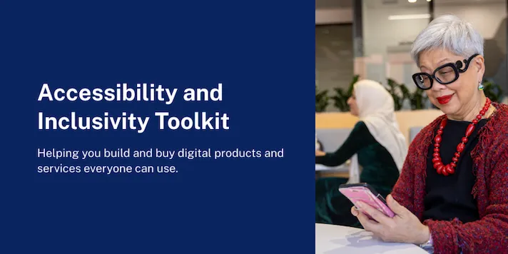
The rename from 'Accessibility and Inclusivity' to 'Accessibility and Inclusivity Toolkit' immediately clarified what the site was for and who it was designed to serve, removing previous confusion about the site's purpose.
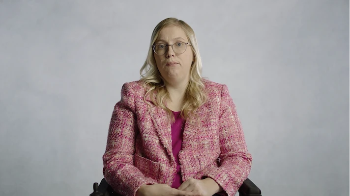
Replaced animated explainer videos with authentic videos featuring people with lived experience of disability and accessibility challenges. This approach built empathy and helped users understand real-world impact rather than abstract concepts.
Here's one of those videos where people with disabilities talk about how digital accessibility positively impacts their lives.
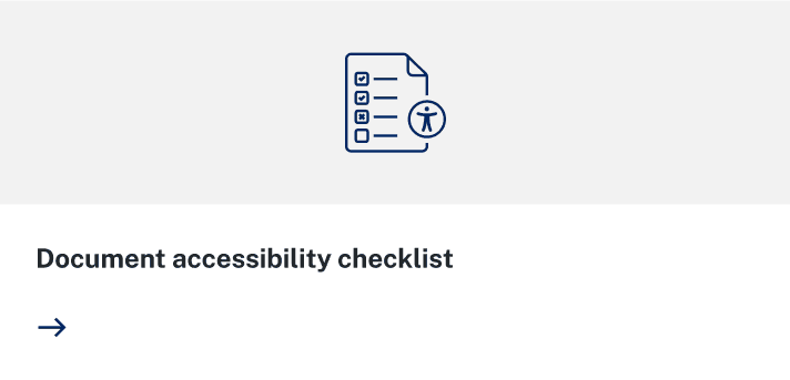
Added a 'Basics' section featuring simple accessibility checks that employees could immediately implement, along with output specific checklists for things like digital documents. This gave users quick wins and confidence to engage with more complex accessibility concepts.
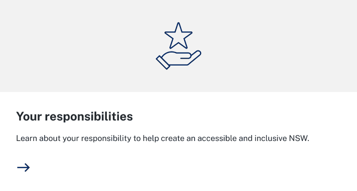
Introduced a 'Your responsibilities' section that clearly outlined accessibility obligations, relevant legislation, and the standards their work needed to conform to. This addressed the pragmatic needs of users who wanted to understand conformance requirements.
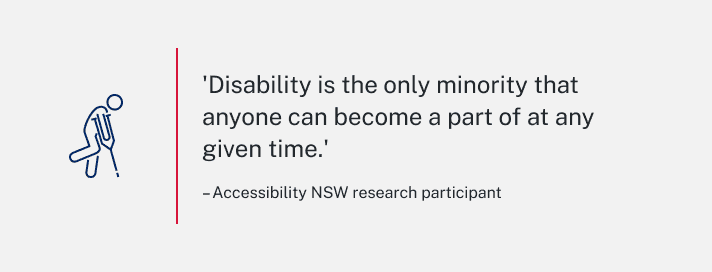
Integrated quotes from people with accessibility needs throughout the site to continuously reinforce the human impact of accessibility work and maintain user motivation beyond initial engagement.
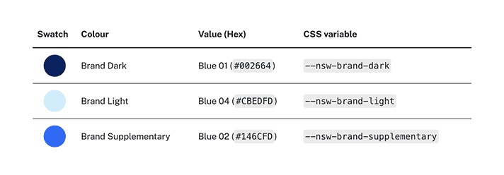
The solution was carefully designed to align with the existing NSW Government brand guidelines and design system. By working within established visual patterns, typography, iconography and component libraries, the Toolkit felt cohesive with other government digital services, maintaining the familiarity and trust that users expected. This approach also streamlined development and ensured accessibility compliance from a technical perspective, as the existing design system incorporated WCAG standards.
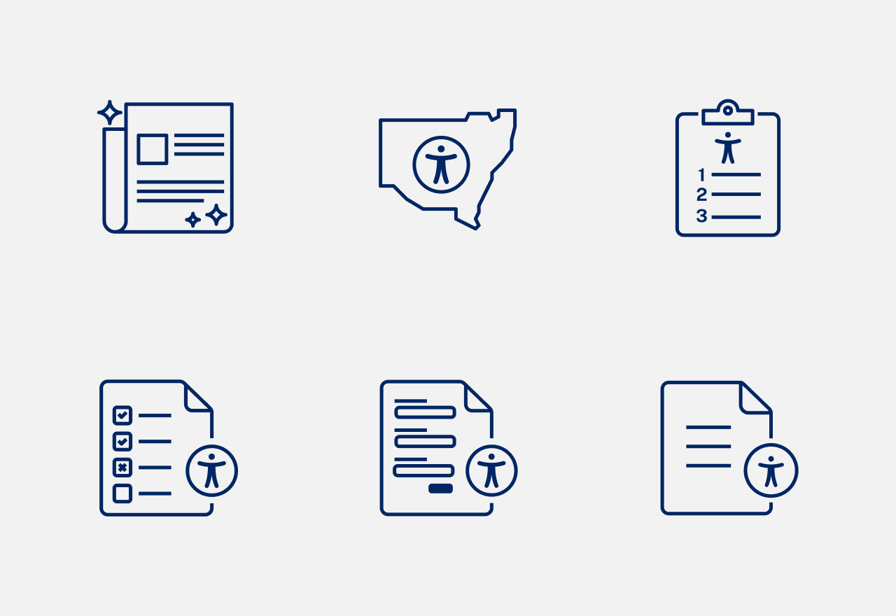
The NSW Design System has a vast library of pictograms, that I used where possible, because consistency is important. I also created some custom pictograms for our purposes, being careful to maintain the same visual design style and specifications.
Following post-launch usability testing, the Toolkit achieved a SUS score of 87, up from the baseline of 75 - elevating the site from 'Good' to 'Excellent' usability and placing it in the 96-100th percentile. Qualitative feedback confirmed users were quicker to understand the site's purpose and found content significantly easier to locate and comprehend.
The project's success has positioned Accessibility NSW as a leader in government accessibility resources, with the Toolkit serving as a model for other jurisdictions and organisations.
The toolkit has been widely adopted across NSW Government and received outstanding usability scores, demonstrating its effectiveness in making accessibility knowledge accessible.
Based on user feedback and analytics, potential enhancements include:
Elevating the accessibility of a government design system
View case study